Collage Ad
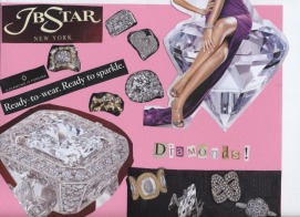
We designed an ad for a product or brand. I really focused on the elements and principles of design to get my product accross. We had to use magazine clippings to make our ad. I made my ad for JB Star diamonds, hence the HUGE diamond on the paper! =)
Flyer #1 - Haunted House
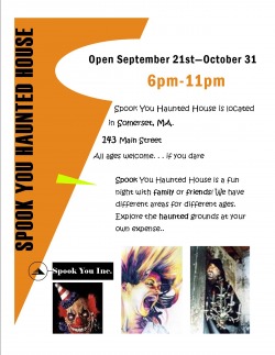
This was the first flyer we had to creat using the computer. Our task was to make a windshield flyer advertising a place or event. I chose to make an ad for Spook You Haunted House. It is a fictional haunted house that I made up. I included all the necessary details including the address, hours, and the date's it is open.
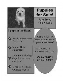
Flyer #2 - Puppies for Sale
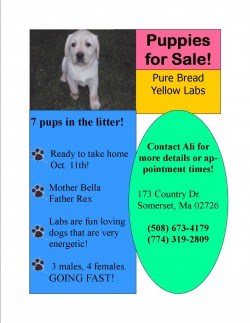
For our second flyer, we had to create another add. The teacher said along the lines of a windshield fyler. I really took that into consideration. I didn't included long paragraphs are little text. I wanted the colors and shapes to attract attention. For this flyer, i used a scanned picture of my own puppy Bella. I included all of the neccessary information such as my address, phone number, and town.
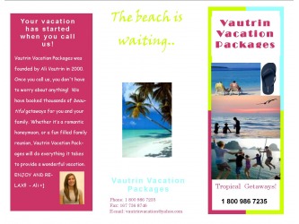
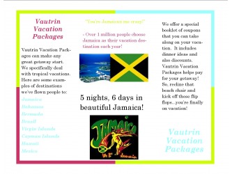
Tri-fold Brochure- Vautrin Vacation Packages
This was the first assignment that involved a tri-fold brochure. We were instructed to make a brochure about a made up business. Also required, was a picture of ourselves. I chose to do a business that set up vacation details and packages. I used my picture as the found of Vautrin Vacation Packages. The color scheme has a meaning behind it. The vacations that I'm selling are mostly tropical. I consistantly used lime green, light blue, and hot pink as my colors because they looked very tropical together. The pictures are always very vacation like. I tried to use colorful pretty pictures to really sell the beautiful vacations!
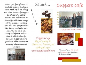
Tri-fold Brochure: Cuppers Cafe
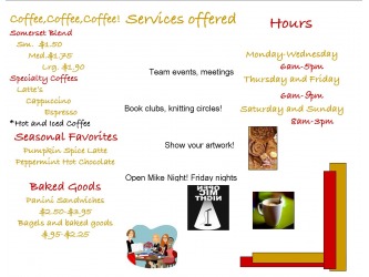
For our second tri-fold brochure project, we had to choose out of three real business's to make a brochure for. The brochure that the business liked the best, would be used! I chose to do Cuppers Cafe in Somerset. We had a list of all the information to include, but it was up to us to produce the final product. I chose to use tan and maroon and my colors because they are warm colors just like coffee. I also included pictures of some food that Cuppers offers. In the inside, is where all the prices and items are. There are special services offered my Cuppers too. I am very please with how my brochure came out!
